
We contemputualized a bold, contemporary Asian dining identity moodboard — fusing rich Eastern heritage with clean, modern aesthetics across every touchpoint from logo to chopstick sleeves.
Client
Haiking
Project
Branding - Concept
Industry
F&B
Tools Used
Illustrator, Photoshop
Collaterals
20
Brand Identity
Overview
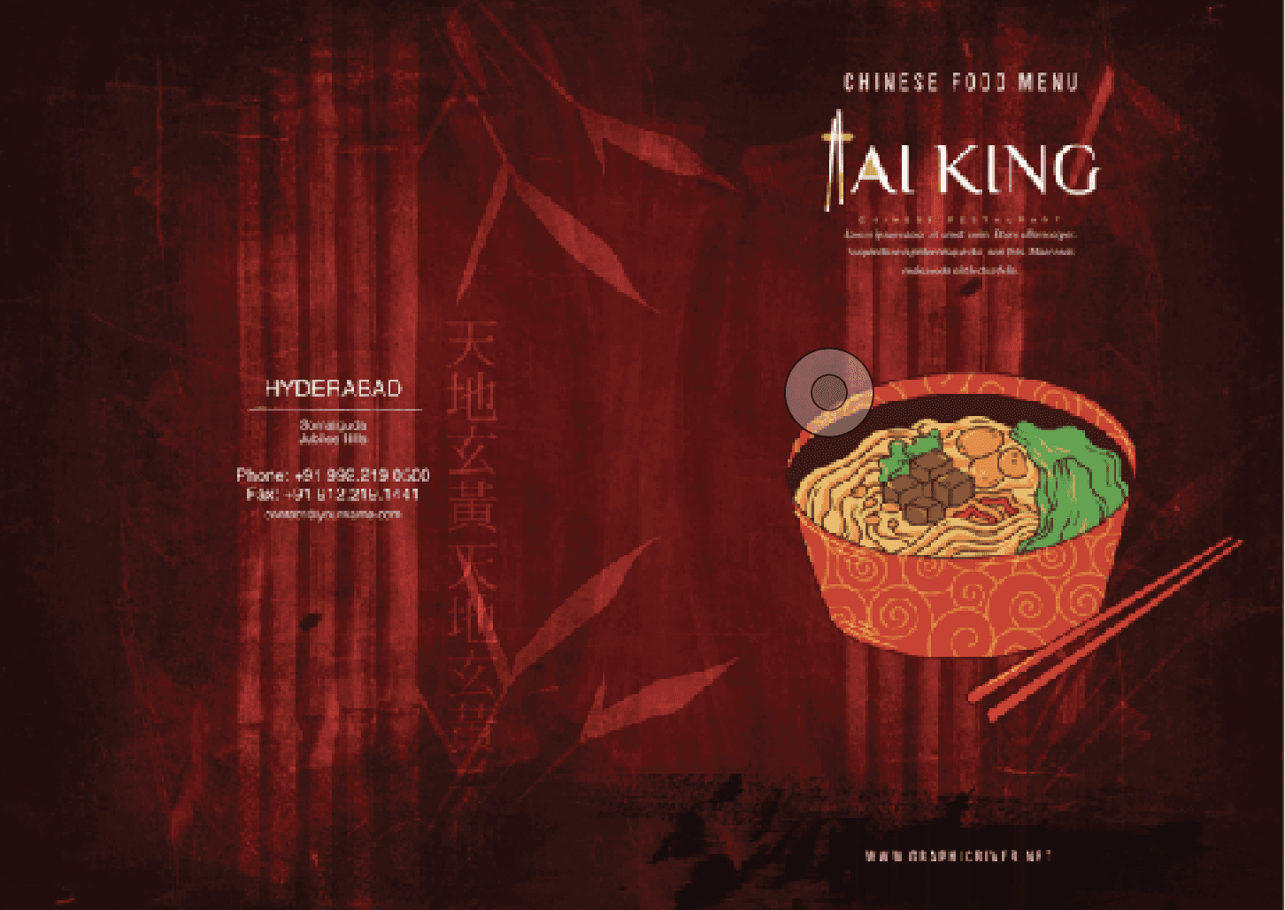
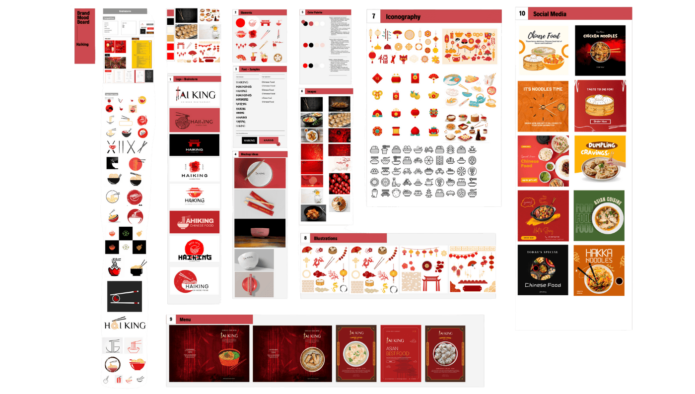
Haiking, a modern Asian restaurant concept based in Hyderabad, approached us in the early stages of their brand journey. The vision was to create a contemporary identity rooted in Asian culture—bold, elegant, and minimal. While the project didn’t move into execution, we were tasked with building the initial creative direction, moodboards, and branding exploration to help define their identity.
Concept Direction
We explored a design philosophy that blended modern simplicity with traditional Asian richness. The brand needed to feel premium but not sterile, expressive but not loud—positioning Haiking as a fresh, sophisticated culinary destination.
Moodboards & Visual Language
The moodboards captured the essence of Asian iconography interpreted through a modern lens—clean typography, subtle cultural symbols, earthy textures, deep color palettes (reds, blacks, golds), and bold graphics with restrained elegance. Inspiration was drawn from street food packaging to upscale Asian bistros, creating a versatile spectrum.
Logo & Identity Exploration
Early logo explorations focused on fusing minimal wordmarks with stylized Asian brushstroke elements or geometric adaptations of traditional symbols. We presented multiple logo pathways—some elegant and serif-based, others more monoline and minimalist—to give the client a range of stylistic expressions.
Packaging & Brand Touchpoints
We ideated sample packaging styles and visual cues—takeaway boxes with custom patterns, chopstick sleeves with brand illustrations, textured menus, and signage mockups. These were meant to guide the visual narrative while staying adaptable to real-world materials and formats.
Overview
Haiking, a modern Asian restaurant concept based in Hyderabad, approached us in the early stages of their brand journey. The vision was to create a contemporary identity rooted in Asian culture—bold, elegant, and minimal. While the project didn’t move into execution, we were tasked with building the initial creative direction, moodboards, and branding exploration to help define their identity.
Concept Direction
We explored a design philosophy that blended modern simplicity with traditional Asian richness. The brand needed to feel premium but not sterile, expressive but not loud—positioning Haiking as a fresh, sophisticated culinary destination.
Moodboards & Visual Language
The moodboards captured the essence of Asian iconography interpreted through a modern lens—clean typography, subtle cultural symbols, earthy textures, deep color palettes (reds, blacks, golds), and bold graphics with restrained elegance. Inspiration was drawn from street food packaging to upscale Asian bistros, creating a versatile spectrum.
Logo & Identity Exploration
Early logo explorations focused on fusing minimal wordmarks with stylized Asian brushstroke elements or geometric adaptations of traditional symbols. We presented multiple logo pathways—some elegant and serif-based, others more monoline and minimalist—to give the client a range of stylistic expressions.
Packaging & Brand Touchpoints
We ideated sample packaging styles and visual cues—takeaway boxes with custom patterns, chopstick sleeves with brand illustrations, textured menus, and signage mockups. These were meant to guide the visual narrative while staying adaptable to real-world materials and formats.
Moodboard
Moodboard

Back to Top